Canadian Rental Association Introduces New Bilingual Logo
Key Highlights
- The Canadian Rental Association has introduced a new logo and visual identity.
The redesigned logo gives equal prominence to the association’s English and French names. - A maple leaf serves as the central symbol of the new design.
- The association will continue to focus on industry advocacy, education and member support.
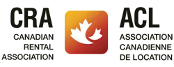
The Canadian Rental Association (CRA/ACL) has introduced a new logo and visual identity, giving the national organization a fresh look while keeping its focus on supporting rental businesses across Canada.
The new design features a maple leaf, a familiar Canadian symbol, as a nod to the industry’s role in supporting construction projects, events and communities nationwide.
One of the biggest changes is the logo’s bilingual design. For the first time, CRA and ACL, the association’s English and French abbreviations, receive equal prominence. The change reflects the association’s commitment to serving members in both official languages.
“This new logo represents more than a refreshed visual identity,” said Melanie Misener, executive director of the Canadian Rental Association. She said the design reflects the association’s role in representing rental businesses and helping them through advocacy, education and industry connections.
While the branding has changed, the association’s work will continue. CRA/ACL plans to keep providing members with industry resources, educational opportunities and ways to connect with other rental businesses, while advocating for the sector’s interests.
The new identity marks a change in how the association presents itself, but its goal remains the same: to represent and support Canada’s rental industry.